CSS scroll-state()
Learning about CSS scroll-state
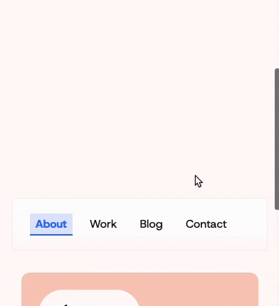
A while ago I read about CSS scroll-state. While building the new version of my website, I got to implement this new feature. This is an extension upon the container queries, to track the state of an element and figure out if it’s scrolling or sticky somewhere. This allows us to add an animation or styling when an element is sticky at the top, like this nav for example.
Header and Nav
I started out with a regular sticky header, which contains a nav element.
header {
  position: sticky;
  top: 0;
}

nav {
  width: 100%;
}
To prevent issues on browsers that do not support this feature, I’ve wrapped the CSS for this in an @supports query.
@supports (container-type: scroll-state) {
  header {
    container-type: scroll-state;
    container-name: header;
  }

  nav {
    width: 100%;
    max-width: 65rem;
    border-radius: 0;
    box-shadow: 0 0px 2px rgba(0, 0, 0, 0.1);
  }
}
And then the part that makes the magic work: @container scroll-state(stuck: top). This waits for the header to be stuck at the top of the page. Within this query I have added the different styling for the nav.
@container scroll-state(stuck: top) {
  nav {
    background: linear-gradient(0deg, transparent 0%, var(--white) 90%);
    border-radius: 0 0 12px 12px;
    backdrop-filter: blur(1px);
    -webkit-backdrop-filter: blur(5px);
    box-shadow: 0 1px 4px rgba(0, 0, 0, 0.1);
  }
}
This was way easier than I expected it to be. The effect I have created is subtle, but I think it looks way better than before.
Full Code
thats all.
header {
  display: flex;
  justify-content: space-between;
  align-items: center;
  justify-self: center;
  position: sticky;
  top: 0;
  width: 90vw;
  max-width: 75rem;
  z-index: 50;
}

nav {
  width: 100%;
  max-width: 65rem;
  background: linear-gradient(0deg, transparent 0%, var(--white) 90%);
  border-radius: 0 0;
  backdrop-filter: blur(1px);
  -webkit-backdrop-filter: blur(5px);
  box-shadow: 0 1px 4px rgba(0, 0, 0, 0.1);
}

@supports (container-type: scroll-state) {
  header {
    container-type: scroll-state;
    container-name: header;
  }

  nav {
    width: 100%;
    max-width: 65rem;
    border-radius: 0;
    box-shadow: 0 0px 2px rgba(0, 0, 0, 0.1);
  }

  @container scroll-state(stuck: top) {
    nav {
      background: linear-gradient(0deg, transparent 0%, var(--white) 90%);
      border-radius: 0 0 12px 12px;
      backdrop-filter: blur(1px);
      -webkit-backdrop-filter: blur(5px);
      box-shadow: 0 1px 4px rgba(0, 0, 0, 0.1);
    }
  }
}
Support
This is a new feature and is only available in Chrome and Edge 133+ at this time — May 2025.