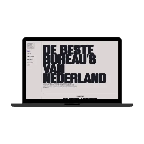
DDA - View Transition
November 2024
Creative Spike focused on using your creativitiy to create a view transition.
View this project here
At FDND we had a special sprint where we got to let our creativity run free, build fun stuff, and let go of the styleguide of our client. Each week we got a new random prompt, focused on a certain new feature or technology.
The Challenge
This week my prompt was Glitzy Brutalist View Transitions.
I loved this prompt, since I’ve always been interested in brutalism and immediately had some cool ideas on how to implement that aesthetic into the Dutch Digital Agencies website. I ended up ignoring the glitzy part and leaning into the brutalist style.
My Solution
I started by analyzing the prompt and breaking it down. In architecture, brutalism means raw materials, visible structure, and no unnecessary decorations. In web design, this often translates to black-and-white layouts, strong grid structure, minimalism, bold fonts, and functional aesthetics.
I decided to translate this into a bold view transition.
Before building anything fancy, I explored how view transitions work. I began small: animating the active link in the nav using a ::before pseudo-element.
.active::before {
  view-transition-name: active-link;
}
This one-liner already created a smooth animation between the nav items. Now that I understood how view transitions work, I moved on to the main transition.
I wanted an interactive, brutalist graphic. I built this one using P5.js and Svelte. Inspired by this wavemaker example, I created my own version that animated the text “DDA” in a glitchy, distorted way.
To integrate this into the site’s layout, I placed the component inside Layout.svelte and used a reactive boolean isTransitioning to toggle it’s visibility during page transitions. This component fades in and out during navigation and sits on top of everything with position: fixed.
<div class="bg" class:show-transition="{isTransitioning}">
  <Graphic />
</div>div.bg {
position: fixed;
width: 110vw;
height: 110vh;
opacity: 0;
pointer-events: none;
transition: opacity 0.5s ease;
}
div.bg.show-transition {
opacity: 1;
pointer-events: auto;
}For the actual view transitions between pages, I used ::view-transition-old(root) and ::view-transition-new(root) with custom keyframes to animate a sliding effect:
@keyframes slide-out {
  from {
    transform: translateX(0);
    opacity: 1;
  }
  to {
    transform: translateX(-20%);
    opacity: 0;
  }
}

@keyframes slide-in {
  from {
    transform: translateX(20%);
    opacity: 0;
  }
  to {
    transform: translateX(0);
    opacity: 1;
  }
}
It gave the whole page a dramatic and intentional motion that felt super polished.
The Result
A bold, brutalist-inspired transition with a custom glitchy animation overlay, smooth sliding effects, and fully custom interaction. The view transitions felt cohesive and visually interesting — and they completely transformed the way the site felt when navigating.
This felt like a real departure from typical smooth/clean animations. It had character.
Reflection
This is still one of my favorite projects I made in school! It was a great mix of concept, code, and creativity. I learned how powerful and even simple view transitions can be. I ended up using the view transition on the navigation on the end result of the real project! And have used that view transition on my personal website and other projects.
View this project hereThis project uses an API that is still being used and worked on/with by other students. This means that this project may not work anymore.