Enriching the Sportkaart Data with New Events
2025-06-17
A case study on extending the Sportkaart platform with data from a new API.
Enriching the Sportkaart Data with New Events
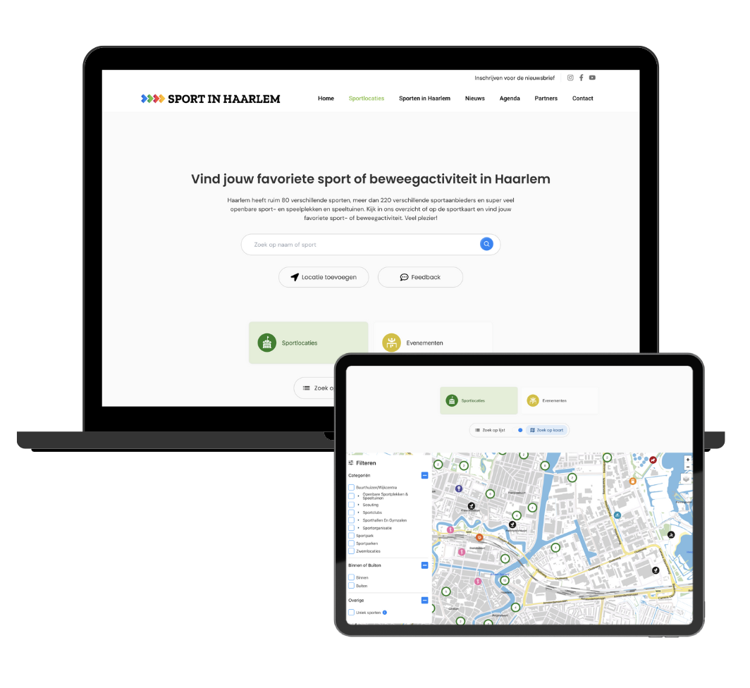
During my internship at Atlantis Digital in Haarlem, I worked on the Sportkaart for Sport in Haarlem, an interactive map that shows all sports activities and locations in the city. One of my main tasks was to enrich the platform by adding event data from an external API.
The Challenge
The Sportkaart already worked with a dataset of sport locations. Now we wanted to integrate a second data source, events, without breaking or overcomplicating the UI.
This required changes to both the backend (PHP) and frontend (JavaScript), and a way to merge two differently structured APIs into one seamless interface.
My Approach
Reading and Mapping the Codebase
I started by reading through the existing codebase to understand how data was fetched and passed to the frontend. Then I compared the structure of the current data with the new event API.
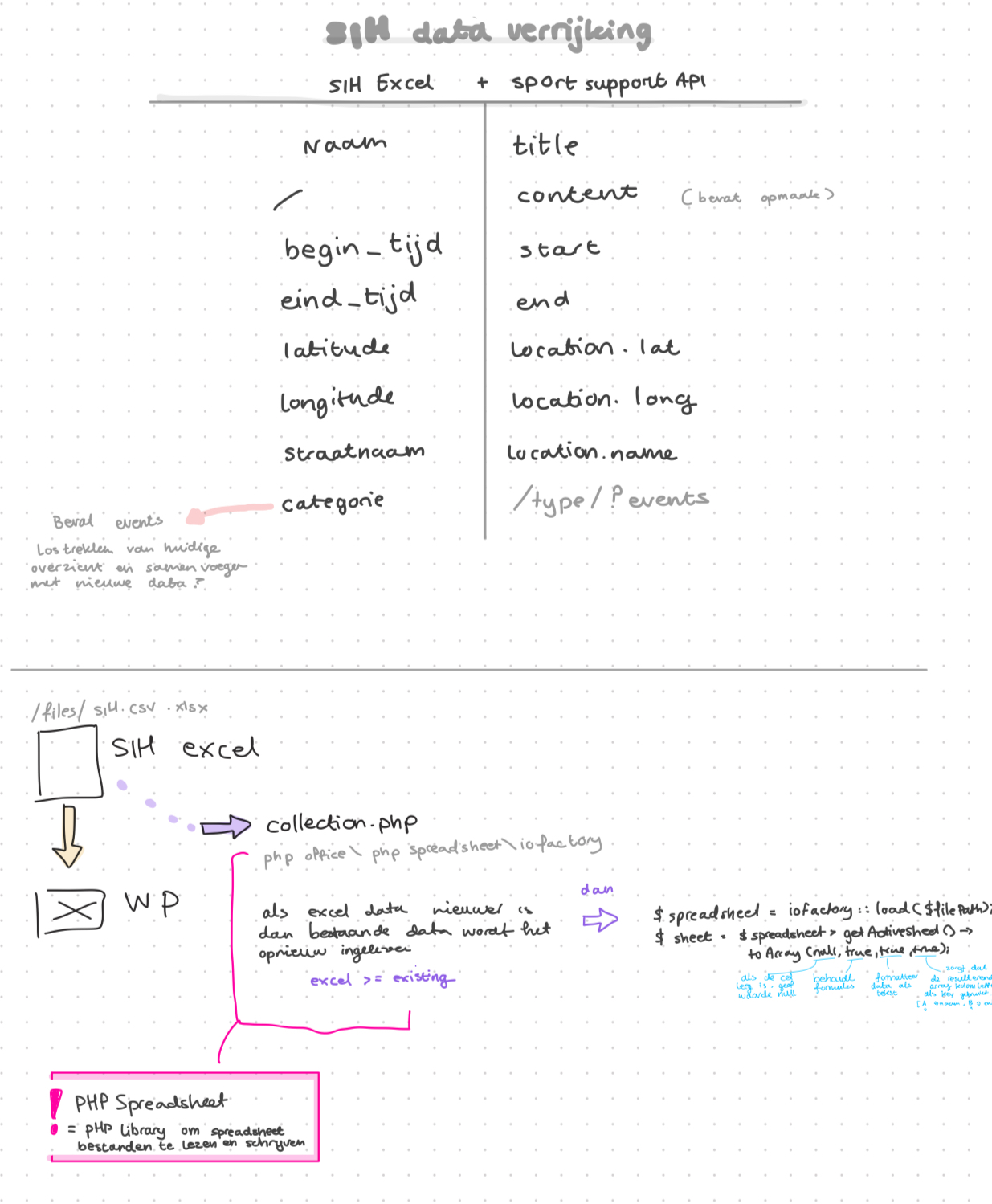
At this point, I had only learned PHP through Codecademy. So I researched how to fetch data in PHP and experimented using file_get_contents() combined with json_decode() inside a try block to safely parse and inspect the data.
Cleaning Up the Incoming Data
The data worked. But the content was messy: inline styles, WordPress block artifacts, random characters, broken formatting.
At first I tried to clean this manually with str_replace, regexes, and string functions… but that quickly became chaotic and unreadable. Eventually I found do_blocks(), a native WordPress function that parses block content and returns clean HTML. That solved 90% of my problems instantly.
More about that in this issue →
Combining the Datasets
Once cleaned, I passed both datasets to the frontend. Since they were both arrays of objects, merging them in JavaScript was straightforward. I did have to standardize some fields (like name vs title, and how descriptions were structured) so the filters and UI still worked correctly.
Improving the Interface
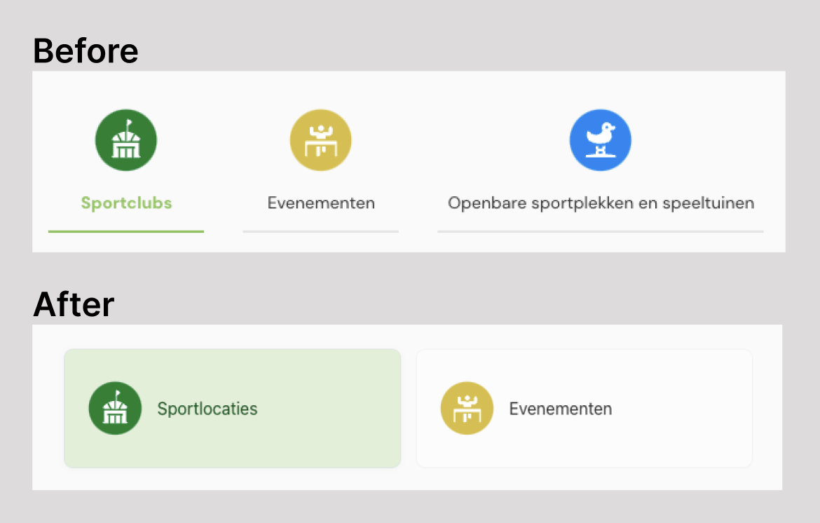
The original UI had a lot of filter buttons, twelve categories at the top and checkboxes in the sidebar.
From 12 Buttons to 2 Tabs
We decided to introduce a tab-based toggle instead of multiple filter buttons. I updated the component, implemented the logic, and made some accessibility improvements along the way, like increasing the contrast.
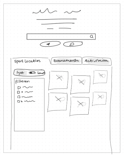
Rethinking the Layout
After implementing the tabs, the rest of the layout felt inconsistent. The search bar, filters, and toggle were all different sizes and misaligned. I made a quick sketch to explore a cleaner layout where tabs feel like tabs, and controls are grouped more logically.
The Result
By combining datasets, cleaning up messy content, and reworking the UI, I was able to make the Sportkaart smarter and more usable. This gave users access to both locations and events in one unified interface, without a long list of buttons. The events now also have more fitting filters, like age target, type of activity, and district.
The new layout hasn’t been implemented yet, but I’m excited about the direction it’s going in and hope to finish it soon.
Reflection
This was my first real project involving PHP, external APIs, and data transformation. I learned a lot about problem solving, backend logic, and keeping frontend performance in mind while working with live data.
I also really enjoyed the mix of backend and frontend tasks, and seeing how even small layout changes can have a big effect on usability.
Even though this was a smaller project, it sharpened my skills in code reading, debugging, and designing for real-world data.